Student Mobile App: Redesign
Globestar EduTech Pvt Ltd
Student Mobile App: Redesign
Note: This case study focuses on design process and approach rather than specific features due to NDA restrictions. Full details available during interview discussions.
Overview
Timeline: October 2025
Platform: iOS/Android Mobile App
My Role: Associate UI/UX Designer
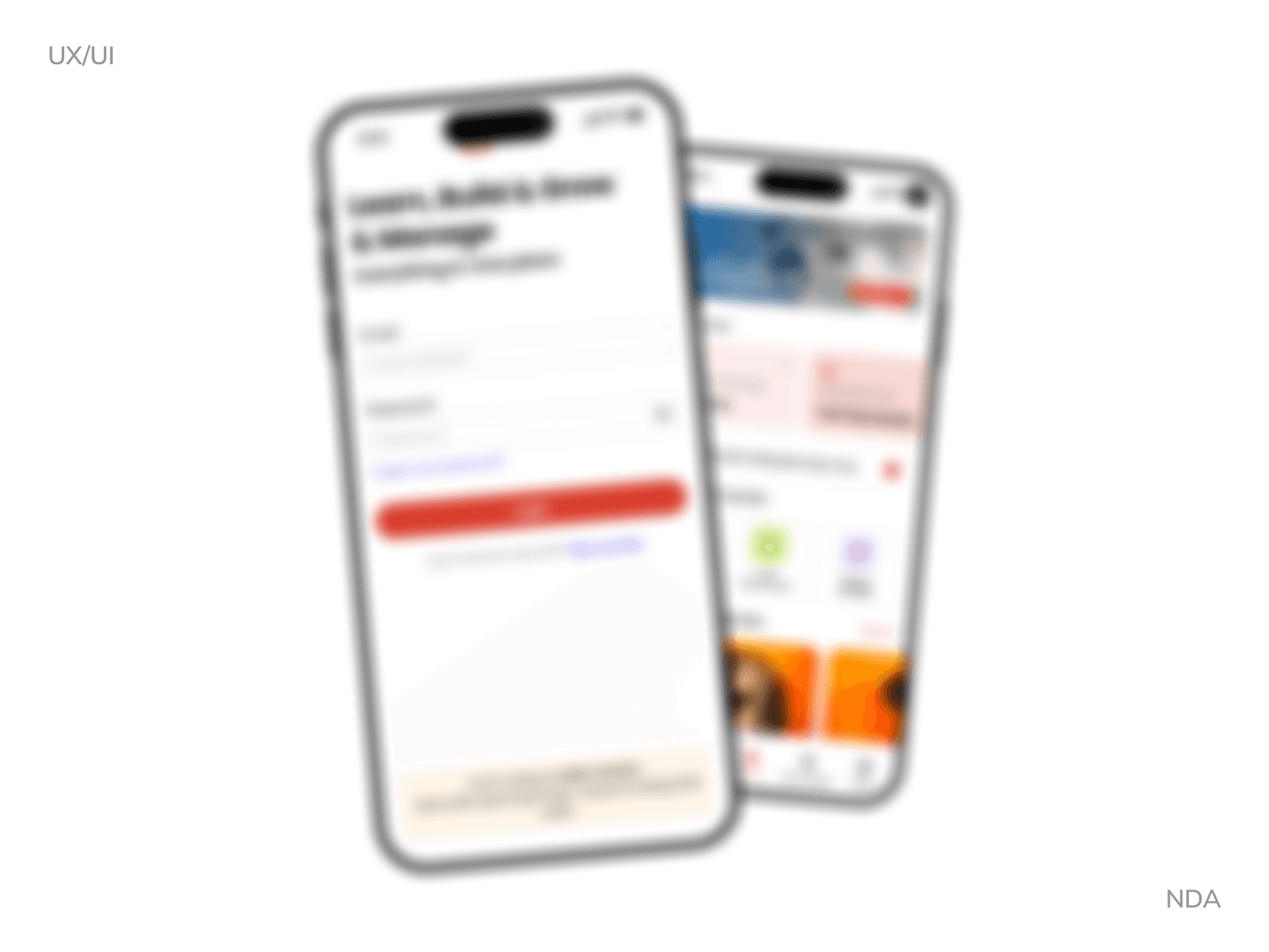
Scope: Designed 80+ screens in 1 week sprint
The Challenge: After joining the vendor dashboard project, I was immediately pulled into a parallel mobile app initiative. The team needed a complete student-facing experience designed rapidly to align with an upcoming development sprint.
The Sprint Context
Learning the Platform
While ramping up on the vendor dashboard, stakeholders shared plans for a companion mobile app targeting the student/learner persona. Few designs existed.
Rapid Mobile Design
Given one week to redesign the existing screens and design remaining screens for student journey from onboarding through core engagement flows.
Key Constraints:
5 business days to design complete app experience
Limited time for iteration
Had to align with web platform patterns while optimizing for mobile
Multiple stakeholder reviews needed within the week
My Design Approach
Day 1-2: Foundation & Architecture
Information Architecture Mapping
Analyzed web platform to understand core user journeys
Identified which features needed mobile-first optimization
Defined screen hierarchy and flow priorities
Design System Planning
Audited web components for mobile adaptation
Planned card-based layouts for thumb-friendly interaction
Established mobile-specific spacing and typography scale
Defined bottom navigation pattern for primary actions
Day 3-5: High-Fidelity Design
Screen Design Sprint
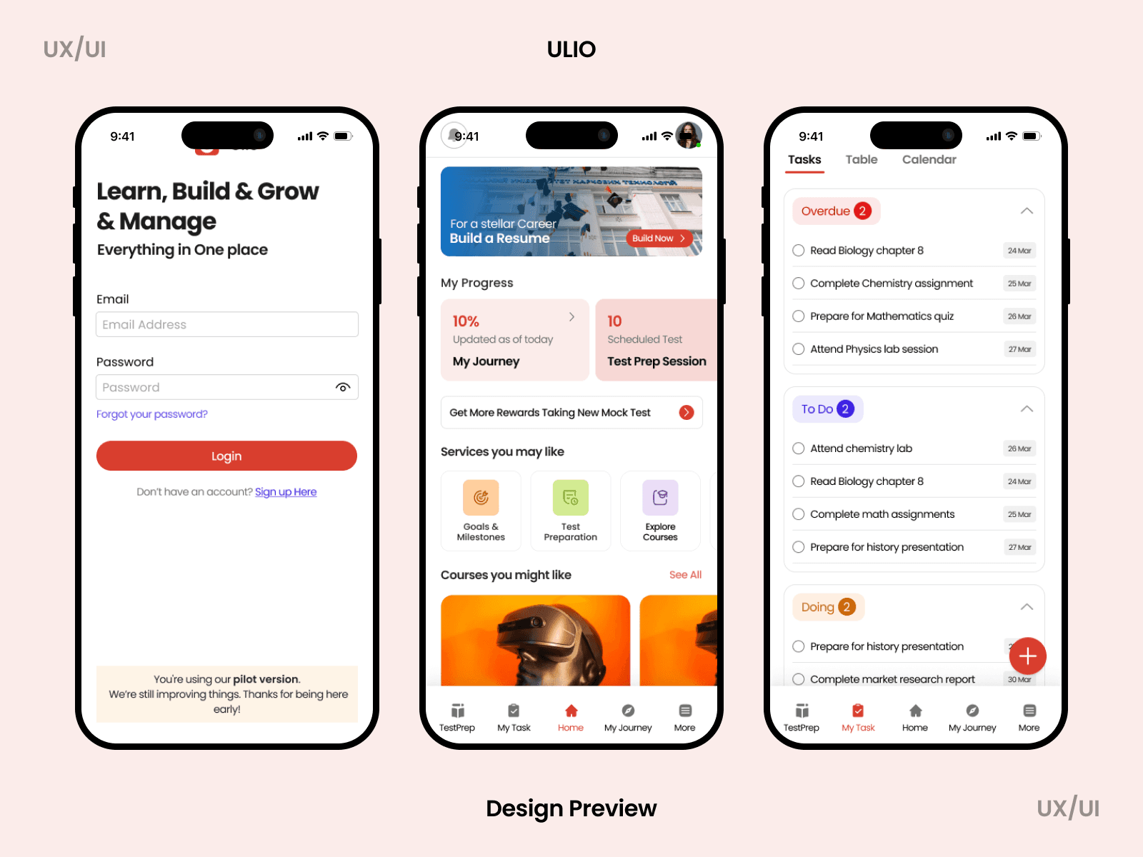
Designed 80+ screens including:
Progress tracking interfaces
Content browsing and discovery patterns
Profile and settings management
Empty states and error handling
Key features screens
Mobile-First Decisions:
Card-based UI for scannable content
Bottom navigation for reachability (primary actions within thumb zone)
Progressive disclosure to reduce cognitive load
Gesture-friendly interaction patterns
Optimized for one-handed use
Key Design Principles Applied
1. Visual Hierarchy for Quick Scanning
Challenge: Mobile screens have limited real estate
Solution: Used card-based layouts with clear visual hierarchy, color coding for quick information parsing, and progressive disclosure patterns
2. Thumb-Friendly Navigation
Challenge: Users need one-handed operation
Solution: Bottom navigation for primary actions, key CTAs positioned in comfortable reach zones, swipe gestures for secondary actions
3. Consistency with Brand
Challenge: Mobile app needed to feel cohesive with web platform
Solution: Adapted existing color system, maintained brand personality, used familiar iconography and patterns from web
4. Progress Visualization
Challenge: Users need to track their journey
Solution: Designed multiple progress indicator patterns, visual feedback for completion states, motivational UI elements
5. Content Discovery
Challenge: Help users find relevant content quickly
Solution: Card-based browsing, clear categorization, visual thumbnails for engagement, recommendation sections
Design Outcomes
Deliverables Completed (5 Days)
80+ high-fidelity mobile screens
Responsive specifications (iOS and Android considerations)
Empty states and error handling screens
Key Challenges & Solutions
Tight Timeline → Core flows first, design system in parallel, established patterns
No Research Time → Competitive analysis (Duolingo, Coursera, Udemy) + mobile best practices
Dual Platform → Platform-agnostic designs with adaptation notes
Speed vs Quality → Clear scope boundaries, systems thinking, documented decisions
Next Steps
Post-Launch Plans:
User testing with 8-10 target students
Analytics implementation for behavior tracking
A/B testing key conversion flows
Iteration based on real user data
Phase 2 Features (Documented):
Enhanced personalization
Social features integration
Offline mode capabilities
Advanced progress tracking
This case study is under NDA. I'm happy to walk through few screens, discuss specific design decisions during interviews.