Program Management Platform Redesign
Globestar EduTech Pvt Ltd
Note: This case study provides an overview of my design process and key decisions. Due to NDA restrictions, some details and screens have been generalized or omitted. I'm happy to discuss the project in more detail during an interview.
Project Overview
Timeline: October 2025
Duration: 2 weeks
Industry: EdTech Management SaaS
Platform: Web Application
My Role: UI/UX Designer Associate
Team: 1 Designer (me), 1 PM, 1 Full Stack Developer
Key Challenges
No Time for User Research
→ Leveraged competitive analysis, heuristics, and customer success team insights who interact with vendors daily
Multiple Stakeholder Priorities
→ Created decision framework and got early buy-in on navigation as "quick win"
Tight Development Timeline
→ Prioritized changes to high-frequency components, documented design debt for future phases
Before & After
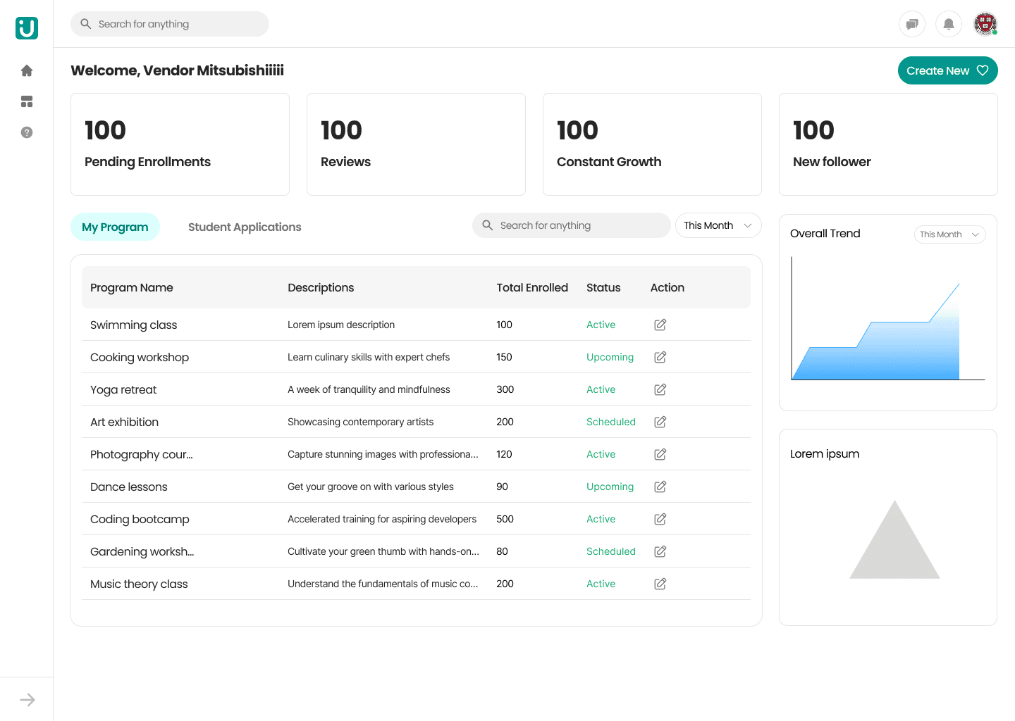
Before: Previous Design
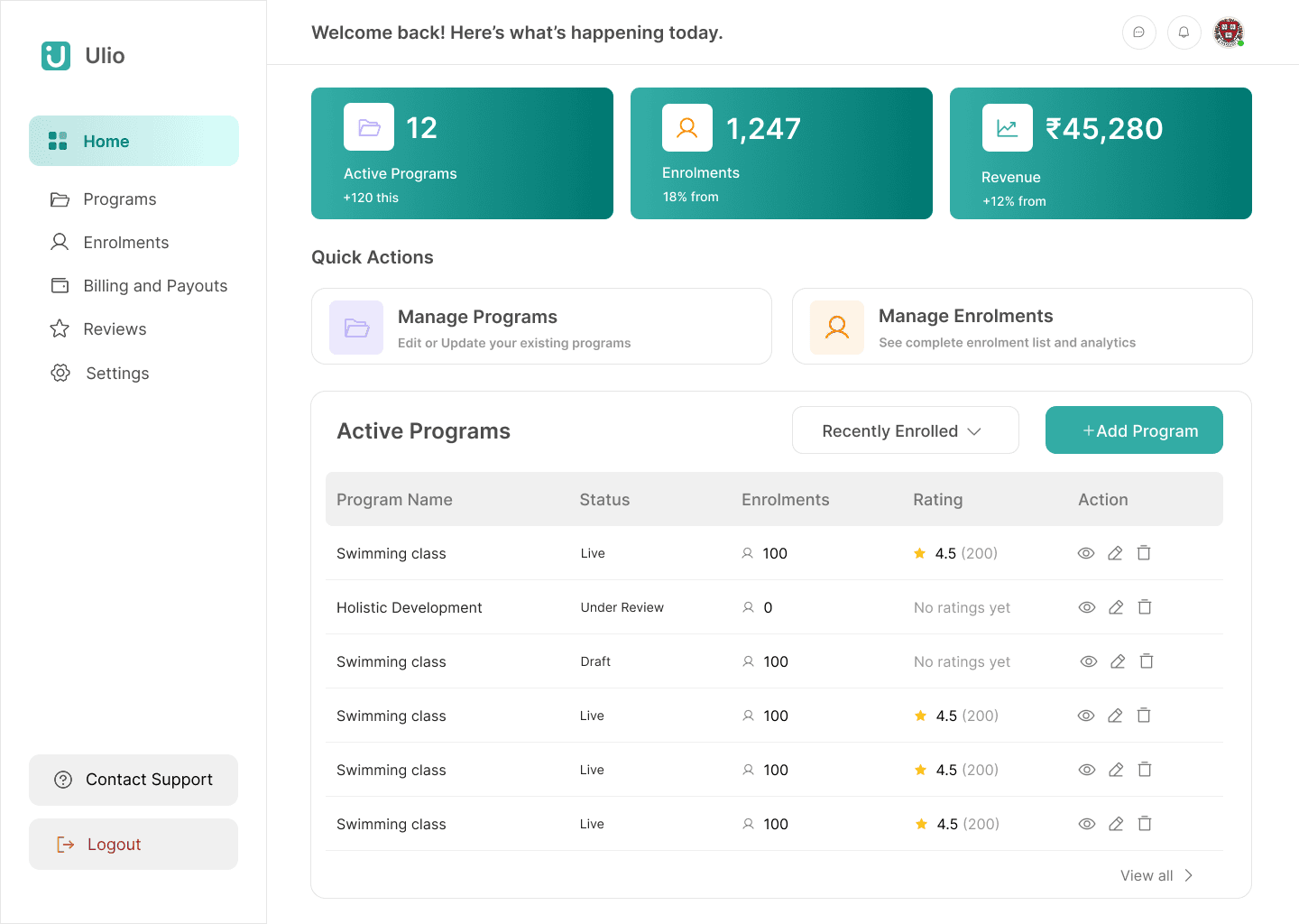
After: Redesigned Dashboard
Key Design Decisions
1. Dashboard Metrics Redesign
Changed: Replaced generic metrics (followers, "constant growth") with actionable business KPIs
Old: Pending Enrollments, Reviews, Constant Growth, New followers
New: Active Programs (+120), Enrollments (18% growth), Revenue (₹45,280, +12% growth)
Why: Vendors need revenue and enrollment trends, not vanity metrics. Added growth indicators for quick trend spotting.
2. Navigation Enhancement
Changed: Icon-only → Labeled navigation with clear hierarchy
Why:
Accessibility (screen reader support)
Reduced cognitive load
Faster onboarding for new users
3. Table Information Architecture
Changed: Removed descriptions column, added ratings column
Old: Program Name | Descriptions (truncated) | Enrolled | Status
New: Program Name | Status | Enrolled | Rating (⭐ 4.5 with count) | Action
Why:
Tables are for scanning, not reading
Ratings provide instant performance feedback
Descriptions moved to detail page where they make sense
Freed space for actionable data
Trade-off: Less information upfront, but better scannability and more relevant data
4. Quick Actions
Changed: Added inline action icons (view, edit, delete) directly in table rows
Why: Reduced clicks for common tasks from 2+ to 1
Impact & Outcomes
Business Impact
Maintained launch timeline (no delays despite significant changes)
Established design system foundation (30% reduction in future rework)
100% stakeholder sign-off
Design Contributions
Created reusable dashboard metric card component
Documented table interaction patterns and status badge system
Expected Results (Post-Launch)
25-30% reduction in time-to-complete key tasks
Decreased support tickets for navigation issues
Better vendor engagement with business metrics
What I Learned
Strategic intervention works: Sometimes improving existing work delivers more value than starting over
Constraints breed focus: Limited research time pushed me to leverage competitive insights effectively
Quick wins build trust: Shipping navigation improvement in week 2 established credibility for bigger changes
Business fluency matters: Understanding vendor pain points through business lens led to better decisions